Matching Skills of Wall Panels and Decorative Paper
Datetime:2026-6-24From: originalClick:6
Summary | Practical guidance on combining wall panels with decorative paper for cohesive, visually appealing interiors.
There is a particular satisfaction that comes from walking into a room where everything just works. The colours feel right, the textures complement each other, and there is a sense of coherence that is hard to pin down but impossible to miss. Getting wall panels and decorative paper to play nicely together is one of the skills that separates a well-designed interior from one that feels thrown together.
Start with the big picture
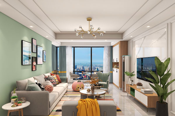
Before you even think about specific products, settle on the overall feel you are aiming for. A Victorian-inspired hallway calls for a very different palette than a minimalist open-plan living space. The decorative paper and wall panels should support the theme, not fight against it. If you are working with an interior designer, have this conversation early. If you are going it alone, spend some time on Pinterest or in design magazines and build a mood board — it will save you from expensive mistakes later.
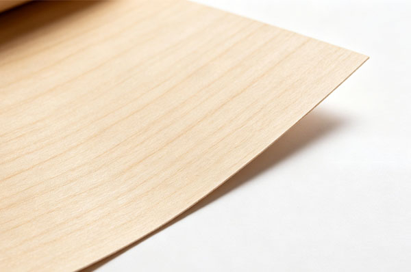
The trick that experienced designers use is to think in terms of layers. The wall panels provide the structural layer — the broad sweep of colour or texture that dominates the room. The decorative paper, whether used as a feature wall or as an accent within framed panels, adds the detail layer. The two should relate to each other, but they should not match too perfectly. A slight tension between them — a warm wood-grain panel against a cool-toned paper, for instance — creates visual interest.
Colour matching without overthinking it
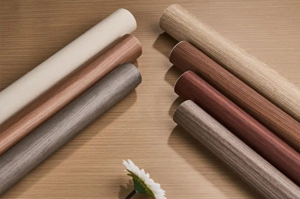
You do not need a degree in colour theory to get this right. Start with the dominant colour in the wall panels and pick a decorative paper that either shares a tone from the same family or provides a deliberate contrast. If your panels are a warm oak, a paper with cream, beige, or soft green undertones will harmonise beautifully. If you want something bolder, consider a paper with a metallic accent or a geometric pattern that picks up one of the secondary tones in the wood.
One rule of thumb that I have found useful: if the wall panels are patterned or heavily textured, keep the paper relatively simple. Conversely, if the panels are plain and understated, you can afford to be more adventurous with the paper. A room where both elements are fighting for attention is exhausting to be in.
Texture and scale considerations
Texture is the secret weapon of good interior design. A smooth, high-gloss wall panel paired with a matte, subtly textured decorative paper creates a pleasing contrast that draws the eye without overwhelming it. Similarly, a rough, rustic panel benefits from the juxtaposition of a smoother paper finish.
Scale matters enormously. Large, open-plan rooms can handle bigger patterns and bolder contrasts. A small bedroom or study, on the other hand, will feel claustrophobic if you use a large-scale pattern on both the panels and the paper. In smaller spaces, stick to finer-grained textures and more muted contrasts.
Pay attention to the direction of any grain patterns. If your wall panels feature a vertical wood grain, a paper with a horizontal pattern will create a clash that most people will not be able to articulate but will definitely feel. Aligning the directional elements creates calm; mixing them creates energy — decide which you want for the space.
Practical installation tips
If you are combining wall panels and decorative paper in the same room, think about the transitions. The joint where the panel meets the paper is one of those details that no one notices when it is done well, and everyone notices when it is not. Use a trim piece or a shadow gap to create a clean boundary between the two materials. This also has the practical benefit of protecting the edge of the paper from peeling.
Lighting is the variable that catches people out. A combination that looks perfect under the showroom's fluorescent lights may look entirely different in the warm, directional light of your living room at dusk. Always, always test samples in situ under the actual lighting conditions before committing. Pin them up and live with them for a few days. Look at them at different times of day. The extra effort is worth it.





 Location: